Colors and Shapes in Desserts: How to Create Visual Balance on the Plate

Colors and Shapes in Desserts: How to Create Visual Balance on the Plate
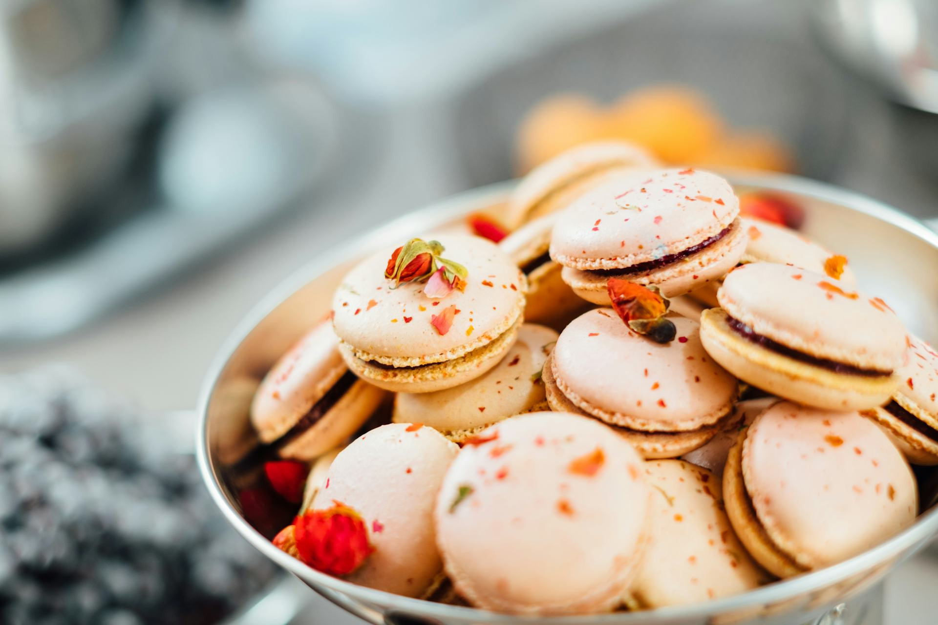
When a dessert is served, the first thing we experience isn’t the taste—it’s the look. Colors, shapes, and textures all influence how we perceive flavor and quality. A well-composed dessert can be as much a visual artwork as a culinary delight. Here’s how to create visual balance on the plate, whether you’re plating a simple fruit dish or an elaborate restaurant-style dessert.
Colors That Work Together
Color affects appetite and expectation. A dessert with harmonious colors feels inviting, while too many clashing tones can look chaotic. Think about your color palette before you start plating.
- Natural hues – Fresh fruit, berries, and herbs bring vibrant, natural colors that rarely go wrong. Strawberries, blueberries, and mint create a classic, summery look.
- Thoughtful contrasts – A dark chocolate mousse comes alive next to a light vanilla cream or a bright raspberry coulis. Contrasts highlight each other but should be used with restraint.
- Monochrome elegance – A dessert built around one color family—say, shades of green or brown—can look sophisticated and calm if you vary the textures.
Think like a painter: use color to create focus and depth, not just decoration.
Shapes and Proportions
The shapes of the elements on your plate help create rhythm and balance. Soft, round forms feel natural and relaxed, while sharp lines and geometric shapes give a modern, precise impression.
- Repetition brings harmony – If you use several components, let some shapes repeat to tie the design together.
- Variation adds interest – Combine a round scoop of ice cream with a square slice of cake and a free-form drizzle of sauce. It creates movement without looking random.
- Mind the proportions – A large dollop of cream next to tiny berries can feel heavy. Distribute elements so the eye moves naturally across the plate.
A good rule of thumb: let one element be the star, and let the others support it visually.
Texture and Surface
Even the most colorful dessert can look flat if everything has the same surface. Variation in texture—crisp, creamy, airy, smooth—adds both visual and sensory depth.
- Mix crisp and soft – A crunchy crumble on top of a silky mousse creates contrast and balance.
- Play with shine and matte – A glossy chocolate glaze stands out beautifully against a dusting of cocoa or freeze-dried fruit.
- Think in three dimensions – Build height by layering or stacking components so the dessert feels lively and sculptural.
Texture isn’t just something you feel—it’s something you see.
The Plate as a Canvas
The plate itself is your canvas. Its color, shape, and size all influence the overall impression.
- White plates highlight color – A classic white plate makes bright ingredients pop.
- Dark plates add drama – They create a more luxurious, high-contrast look, especially for light-colored desserts.
- Leave breathing room – Don’t overcrowd the plate. Space around each element adds elegance and calm.
Think of the plate as a frame that supports—not competes with—the dessert.
Garnish with Purpose
Garnish should be more than decoration; it should make sense. An edible flower, a sprinkle of nuts, or a swipe of sauce can tie the whole composition together when used intentionally.
- Repeat colors from the main components to create unity.
- Use asymmetry – A slightly off-center placement can make the design feel more dynamic.
- Keep it restrained – Too much garnish can distract from the flavor and create visual clutter.
The goal is to find balance between natural and refined—just like in taste.
Læs også:
The Complete Experience
A dessert that looks beautiful often tastes better because the brain is already primed for pleasure. Visual balance isn’t about perfection; it’s about harmony—colors, shapes, and textures working together so the eye and palate share the same experience.
Next time you plate a dessert, ask yourself: Where does the eye rest? What creates contrast? And how can simplicity be your strength? The answer often lies in what you choose to leave out.
Læs også: